Who would have known that each small detail in our lives may
have a story? Even your car logo has a story, apparently. The Alfa Romeo’s logo
may have one of the most exciting and weird stories behind it. So what would it
be?
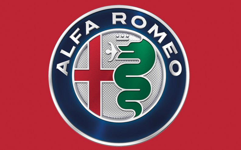
It’s not just a logo, but it’s a story itself. If you look
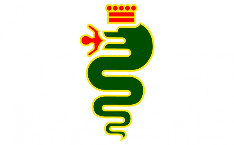
at it, you may notice the white flag with the Red Cross. This is the flag that
symbolizes the connection between Milan city and Saint Ambrose who was a Bishop
of Milan a very, very, long time ago. But what does it have to do with the car?
Just wait until you find out. On the other side, you can see a snake swallowing
a man… Wait, what? This is the Visconti Serpent that also symbolizes Milan
city. Again, what does a car logo have to do with those logos? This is a story
of a war, and not only a logo.
The story is really simple: the Italian manufacturer Alfa
Romeo carries proudly the symbols and the emblems of its historical city,
Milan. As for the serpent eating a man, the story goes back to the Middle Ages.
The Visconti serpent is simply an emblem of the Visconti family, which was a
very important family in Milan back then. The Viscontis were a noble family
that ruled Milan for more approximately 200 years, between 1277 and 1447. This
is the story of how the Visconti Serpent ended up as their emblem:
According to the legend, Ottone Visconti, who was the
Archbishop of Milan and the Lord of Milan back then, fought a noble Saracen and
killed him, during the Second Crusade.
Otton Visconti then found the logo on the shield of the Saracen and took it
back with him to Milan. That’s how the logo became a symbol to Milan city, and
it’s now carried in the Alfa Romeo badge. Despite the story of the snake eating
a child or a man, according to Alfa Romeo, it represents for the company in its
logo a snake giving birth to a new human being, so he comes out a “new man,
renewed and purified.”
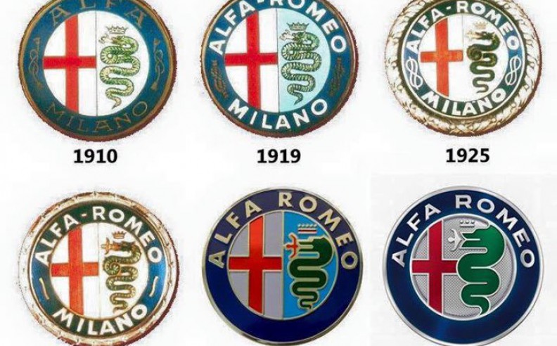
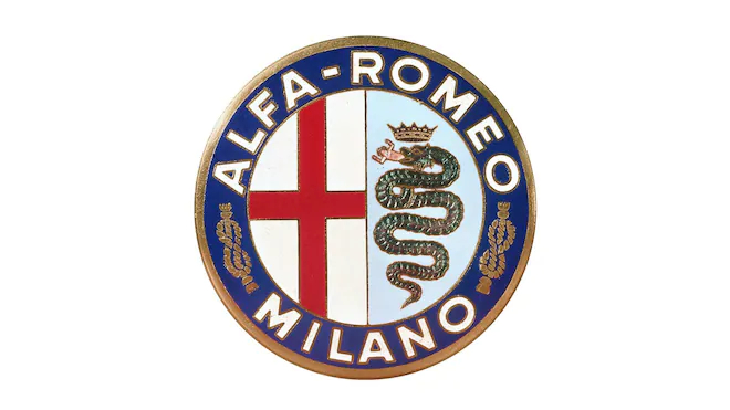
Alfa Romeo has always
carried symbols or names referring to its beloved city. When the company was
first established, it was founded under the name Alfa Milano, carrying the
city’s name in its name. Also, it carried emblems and symbols of the city in
its badge. However, when the company was bought in 1915 by Nicolas Romeo, the
latter substituted the name Milano with Romeo, so it became Alfa Romeo as we
know it today. Even though the name was changed, the design remained as it was.
Also, the word Milano was still included in the logo, which still includes the
snake and the cross flag until now since 1910 when the company was established.
However, the name Milano has been removed after 1972. The logo’s color changed 10
times through the years, until they’ve become as sleek, as clear, and as
elegant as they are today. Even the colors and lines of the snake that is
eating a human has become clearer.
Thus, the emblems in the logo symbolized Milan. Apparently, the company wanted
to be strongly related to its city. However, they took a more “peaceful
meaning” to the snake, by pointing that the eaten man refers to a “renewed
reborn man”, maybe to avoid the question of whether the snake is eating an
Arab, or a baby.
Hani started his career in Automotive Journalism when he was 10 years old as a talented photographer for automotive, hanging around cars all the time has created a passion for the automotive industry since day 1.
He is now a full time auto journalist and content creator for Motor 283.


 SHARE
SHARE